Earlier this week, Corbin Crutchley built a social image generator for the Unicorn Utterances blog using React and puppeteer. This was built from a mockup that was expertly designed by Kevin Aguilar - featuring an intuitive layout, clear accented title text, and a background image displaying arbitrary PHP code on a laptop screen.
As of today, every single blog post on @UnicornUttrncs has a unique social media preview with the title of the blog post
— Corbin Crutchley 🥑 (@crutchcorn) May 20, 2022
Huge thanks to @kevttob for designing the preview image!https://t.co/uh0Her4Y1X
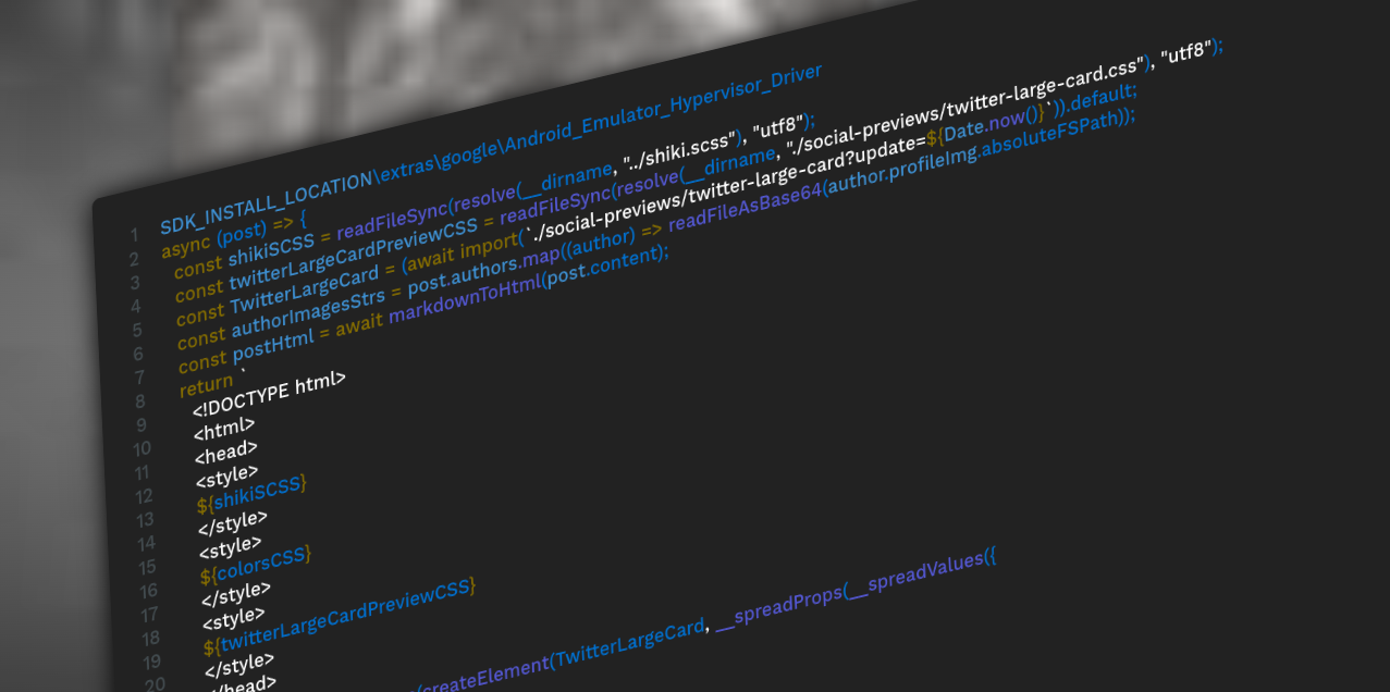
This gave me an interesting idea: what if, instead of displaying arbitrary code, it used the actual code snippets featured in the blog posts? Instead of embedding an image, I could use overlapping HTML elements with some elaborate CSS styling to recreate its appearance with any text content.
Background
-
Unicorn Utterances is a community blog site featuring awesome technical and educational content from a variety of incredibly skilled developers and engineers.
-
The "social/preview image" being described here is what shows up when the link to a blog post is displayed in a post or message on social media. While some social platforms use varying implementations, most of this information is provided through the Open Graph protocol.
Implementation
3D Rotation
The original image (Unsplash) was angled at a specific position that had the camera facing slightly downwards from the top left side of the screen. This is fairly simple to recreate using the rotate3d(x, y, z, a) CSS function. While it required a bit of fine-tuning later on, this allowed for a close approximation of its general appearance.
Depth of Field
The camera also used a very shallow depth of field to focus on a small part of the screen. In the image, this looks more like a post-processing effect applied by an image editor than the actual camera lens. However, there is no easy way to recreate depth of field using CSS - even with the 3d transform functions. I had to find a different way of accomplishing this.
While CSS doesn't provide any visual "focus" properties, there is a blur(radius) filter function which applies a Gaussian blur to any element on the screen. The result looks a lot like the "out of focus" area of the original image.
To create the "in focus" area, I then created a duplicate copy of the element (since this was built in React, this is a lot simpler than it sounds) with a higher z-index value. Using the mask-image property, I applied a radial gradient mask to this element, creating a focused center that gradually fades into the blurred background element.
.codeScreen {
	transform: rotate3d(0.5, 1, 0, 45deg);
	mask-image: radial-gradient(circle 500px at 25% 50%, rgba(0,0,0,1), rgba(0,0,0,0));
	z-index: -2;
}

.codeScreen.blur {
	mask-image: none;
	filter: blur(5px);
	z-index: -1;
}
Grainy Overlay
While this is much closer to the original, I still wasn't done yet. I wanted the result to be almost indistinguishable from the original image. This styling was too perfect and uniform; its appearance was too consistent to be mistaken for anything but a rendered HTML surface.
So what gave the original version its imperfect, authentic appearance? There's a tiny lens flare, slight pixelation of the text... and an almost unnoticeable hint of dust, grain, and possible compression artifacts on the screen.
So I looked up how to implement grainy gradients in CSS.
<svg xmlns="http://www.w3.org/2000/svg" width="600" height="600">
	<filter id="noiseFilter">
		<feTurbulence
			type="fractalNoise"
			baseFrequency="0.65"
			numOctaves="3"
			stitchTiles="stitch"/>
	</filter>
	<rect width="100%" height="100%" filter="url(#noiseFilter)"/>
</svg>
Applying this to a foreground element with low opacity yielded almost exactly the effect I was looking for. Hardly noticeable, but definitely less recognizable as an HTML-rendered surface.

Perspective
There was only one thing left to do, which Corbin actually discovered in a code review: improving the 3d transformation. The current transformation was "isometric," the default behavior of the rotate3d() function; it lacked any perspective projection.
I had previously attempted to apply this using the perspective property, but failed to notice any effect of doing so - perhaps because I was applying it to the wrong element. This property needs to be applied to the parent element of wherever the transformation is taking place.
<div style="perspective: 1000px;">
	<div class="codeScreen">...</div>
	<div class="codeScreen blur">...</div>
</div>

Source Code
This feature is still being reviewed, and more changes might be made before it is rolled out to the website. For anyone interested, the full source code can be found in this Pull Request.