Projects
This is a list of various things I've worked on over the past few years.
This is a list of various things I've worked on over the past few years.

The perfect place to learn all kinds of programming, from introductory ideas to advanced abstractions.
I help maintain our main website, led development of a recent 1000+ commit site-wide redesign, and am currently working on our upcoming CMS!
I've had a fun time learning to write mods & minigames in the block game, some of which have become quite complex!
Look for items in the world to score BINGO tiles, and compete to fill up the board!
This is a huge mod - and I made some interesting architectural decisions while developing it. It's also quite addictive with friends. Some people play it weekly!
An improved, cuter, and non-invasive scoreboard UI redesign!
I used to publish quite a few apps on the Play Store. Many of these are now unmaintained, but remain as examples of my past work.
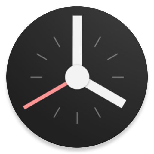
A simple alarm clock focused on design, readability, and internet radio.
A no-root status bar customization tool for Android.
I worked on Status from 2016-2019, where it amassed over 1M downloads. Somehow it ended up in an article on Gadget Hacks.
A lightweight, well designed metronome app for Android - with custom emphasis patterns, saved tempos, and Android Wear support!
A canvas-based Android game on avoiding incoming asteroids.
A short-lived material design Spotify client for Android, aiming to provide improved performance and usability (compared to the official app in 2016).
I'll often take parts of my code and turn them into separate projects so that I can use them in multiple places, and sometimes they help other developers too!
These are a few of my favorites...
A lightweight "about screen" library to allow quick but customizable attribution in Android apps.
A generalized color picker in a dialog that tries to account for most color picking use cases.
Automated API documentation for Ktor/JVM servers!